I figured out early on in the process that my usual hard edged and geometric style of illustration wasn't going to suit an umbrella. So I approached the brief in a more organic way.
I started by visiting my local beach for inspiration and looked for shells, seaweed and different shapes in the sand and in the water. I also took a lot of photographs and brought them back to the studio where I began sketching with a pencil on paper
I then worked them up with paint and black pens.
The shapes were then scanned and imported into illustrator where I arranged them in different compositions until the balance felt right. I wanted the design to be visually interesting but not look overcrowded.
It was also important for the design to work from all sides, so I allowed some of the shapes to bleed off at the edges. My colour inspiration came from the ocean so I used shades of blue with a lemon yellow for contrast.
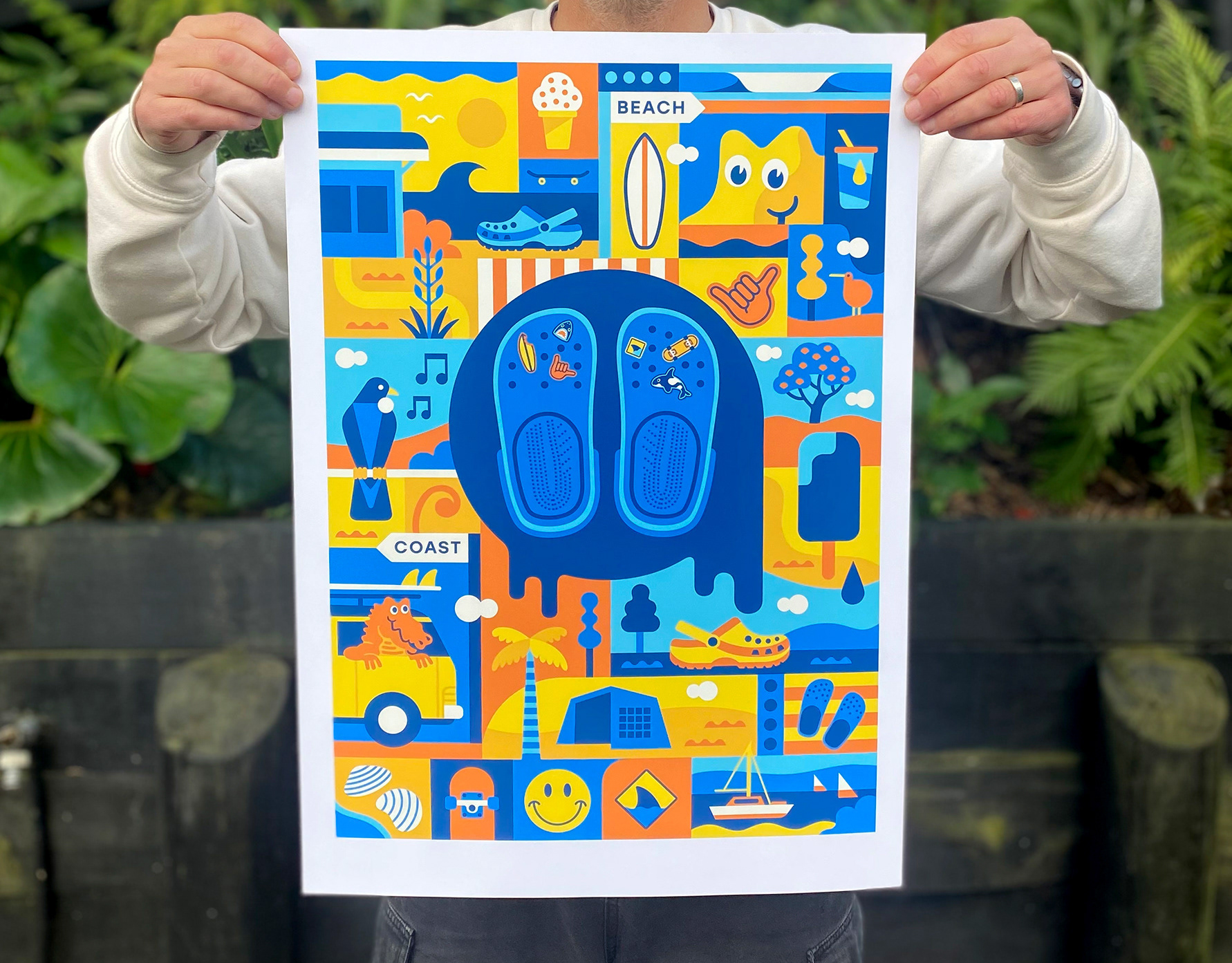
Then I produced a mini series of Limited Edition art prints inspired by the design and available on my website.
